
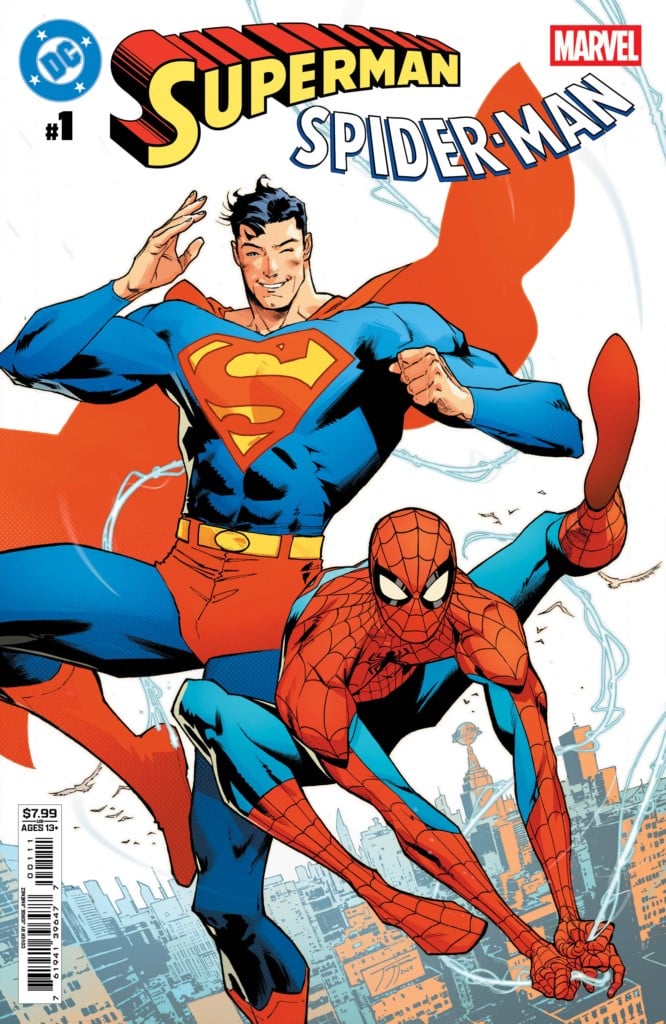
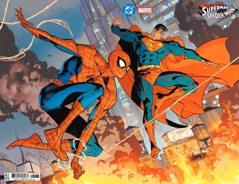
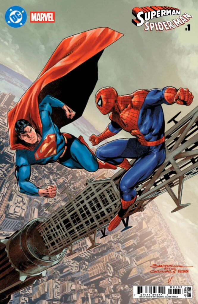
The comic shop has been buzzing about this one for months, and Superman/Spider-Man #1 finally hit the stands as a massive collaboration between DC Comics and Marvel Comics. It’s the kind of event that makes you remember why you started reading these books in the first place. You’ve got Mark Waid and Jorge Jimenez leading the charge on the main story, and the sheer scale of the talent involved is staggering.
Seeing Clark Kent and Peter Parker together as part of a press pool, actually working on a professional project, brought a genuine smile to my face. It feels right. It’s grounded in a way that superhero stories often forget to be, reminding us that these guys have day jobs that occasionally intersect before the capes come out.

Truth, Justice, and Great Responsibility
The lead story, “Truth, Justice, and Great Responsibility,” written by Mark Waid with art by Jorge Jimenez, colors by Tomeu Morey, and lettering by Tom Napolitano, is a visual feast, though the writing feels a bit light. Jimenez is absolutely the star of the show here. His art is carrying a lot of the heavy lifting. I absolutely love Brainiac’s head design in this issue. It’s giant, it’s awesome, and it feels appropriately menacing.
Jimenez gives us a spread of Superman and Spider-man in the sky for the first time with the Metropolis skyline in the background that is simply gorgeous. It’s one of those images you want to tear out and pin to your wall. He also delivers a fantastic panel of Peter with half his mask torn away, struggling to lift a mountain of rubble. It’s a classic Spider-Man trope, but Jimenez makes it feel fresh and desperate.
The story itself feels a bit bare bones. I appreciated the villain swap: putting Superman against Dr. Octopus and Spider-Man against Brainiac. It makes sense. Why should they fight the same guys they’ve been fighting for decades? Let’s switch it up. Seeing Doc Ock and Brainiac together is a tentacle-lover’s dream, even if their motivations are a bit thin. They both hate “mudball” Earth, which fits Brainiac’s alien outlook, though it’s a little weirder for Otto. I guess when the world doesn’t recognize your genius, you start looking for the exit.
There were some logic leaps that made me scratch my head. We get Kryptonite because it’s a Superman story, but then Waid throws in “Californium.” I had to check if I was tripping or if that’s a real metal (it is, but its use here is very “comic book science”). The “Spider-sense beats math” line felt a bit silly and leaned too hard into the “don’t think about it” territory. The way Brainiac gets defeated is also confusing. He’s winning one minute, beams up to his ship, and then he’s just out cold on the ground in the next scene. I felt like I missed three pages of context.
Still, Waid knows how to write a zinger. When Spidey tells Superman, “I bet you’re not this impatient with Batman!” I knew the price of admission was worth it for that line alone. And seeing Spider-Man coat a depowered Clark in webbing to protect him while he jumps into a burning building? That’s the kind of charming, expert-led character work I wanted from this book.
Nostalgia and Sentinels in World’s Finest
Tom King and Jim Lee team up for “The World’s Finest,” featuring Lois Lane and Mary Jane, which feels like a warm hug from the 90s. The chapter is rounded out by Scott Williams on inks, Alex Sinclair on colors, and Pat Brosseau on letters. Jim Lee’s art hasn’t lost a step. It gives off this incredible nostalgia for a different era of comics. The action is frantic as Superman and Spider-Man take on a Sentinel. It’s a fun sequence, but Lois and Mary Jane are the ones asking the real questions: Why is a Sentinel here? They usually only hunt mutants.
The reveal that Gambit is the actual target was a great clutch moment. Lee drawing Gambit again felt right, and the banter between Lois and May Jane in this chapter was some of the best in the book. It’s fast, it’s funny, and it understands exactly what it needs to be.
Meta-Madness and Superboy-Prime
Christopher Priest and Daniel Sampere give us “Pages,” which is easily the oddest entry in the book. This story features Superboy-Prime and the Amazing Spider-Man, and it’s pure Priest. You get the signature blacked-out panels and a very meta narrative. Alejandro Sánchez provides the colors, and Willie Schubert handles the lettering. Superboy-Prime’s voice here is… interesting. He sounds modern, almost like a Gen-Z version of the character that feels slightly “too hip” and nonchalant.
The art by Sampere and Sánchez, however, is vibrant and crisp and a real showstopper. Their High Evolutionary looks grand in a bold, shiny red coat. I loved the background detail of twirling comic book panels representing Superboy-Prime and the Amazing Spider-Man’s different histories. This one reads a bit disjointed, like Prime and Peter are speaking two different languages, but the visuals are so gorgeous that you almost don’t mind the head-scratching references.
Futures Past and Cybernetic Mouths
Sean Murphy brings his distinct style to “Beyond the Cobwebs of Tomorrow,” acting as both writer and artist for the story featuring Superboy and Spider-Man 2099. Simon Gough handles the colors, while the lettering is done by AndWorld Design. Right from the start, Miguel O’Hara is reaching out toward the reader in a way that totally grabs you. Murphy nails the iconic black-and-red 2099 suit, but his Superboy is a little scrawnier than I’m used to.
The highlight of this story is the interaction between Miguel and Terry. Spider-Man 2099 admitting that Terry’s teeth showing through the mask freaks him out is hilarious, and a great meta-commentary on a design choice fans have debated for years. However, this felt more like a Batman Beyond/Spider-Man 2099 team-up with Superboy just being there for the billing, though I will say, seeing Bruce in Terry’s ear trying to keep secrets from a kid with super-hearing was a great touch. It felt like Murphy had 20 more pages of story to tell, and I hope we get them eventually.
Short Bursts and Heavy Hits
Matt Fraction and Steve Lieber give us a very brief, random story called “Jimmy Con Carnage,” with colors by Nathan Fairbairn and lettering from Clayton Cowles. It’s short, Jimmy Olsen dies (sort of?), and the main takeaway is don’t walk down blind alleys in Manhattan and never forget the hyphen in Spider-Man. It’s a bit of a throwaway, but the art is great.
On the flip side, “The Bridge” by Jeff Lemire and Rafa Sandoval is a beautifully sweet story about Jonathan Kent and Ben Parker. The story is colored by Ulises Arreola and lettered by Becca Carey. It focuses on the men who shaped our heroes. It’s a poignant reminder that while they come from different worlds, the values they instilled are identical. The final shot of Superman and Spider-Man by Sandoval is another absolute poster material.
The Daily Debate and a Punishing Date
Greg Rucka and Nicola Scott handle the journalism side of things in “Bias”. The colors are provided by Marcelo Maiolo with lettering by Ariana Maher. J. Jonah Jameson and Lois Lane going head-to-head on the ethics of masked heroes is exactly what I wanted. Jonah makes some valid points about accountability, while Lois counters with the importance of judging people by their actions rather than their appearance. Nicola Scott’s art is, as always, gorgeous.
The book ends on a high note with Gail Simone and Belen Ortega’s “Blind Date,” featuring Power Girl and the Punisher. Colorist Jordie Bellaire and letterer Lucas Gattoni round out the creative team. This one was fun. Frank Castle, working as a bouncer at a supervillain hideout, is definitely inspired. Seeing Frank’s reaction to Karen was hilarious: “Lord have mercy” is not a line you expect from the Punisher, but it worked perfectly!
The dynamic between the gloomy, dark Punisher and the bright, white-and-gold Power Girl is great visuals. Plus, seeing Paul (the guy the Spidey fandom loves to hate) show up as Karen’s uninterested date was a stroke of genius. He’s the “nice guy” who eventually slinks back to his ex, leaving Karen to share drinks with Frank. It’s charming, funny, and easily one of the best-written segments in the entire issue.
Final Verdict
Overall, Superman/Spider-Man #1 is a bit of a roller coaster. The main story is a little thin on plot, and the pacing is all over the place, especially the villain’s defeat. However, the art by Jorge Jimenez and the nostalgia of the backup stories make it a must-buy for any fan of Superman and Spider-Man. It’s not the greatest thing ever, but for a fun, silly crossover, it delivers the moments that matter.