
Lobo #2 is exactly the kind of chaos you want when you hand the keys of the DC universe to Skottie Young and Jorge Corona. It’s an aggressive, biting critique of the modern entertainment machine that manages to be hilarious while keeping the Main Man’s boots firmly planted in the gutter. After the first issue set the stage with a classic barroom brawl, the second issue moves into a much more interesting territory: tackling the nightmare of brand management and the sanitization of anti-heroes for a general audience.
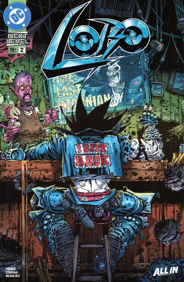
- Title: Lobo #2
- Creatives: Skottie Young (Writer), Jorge Corona (Artist), Jean-François Beaulieu (Color Artist), Nate Piekos (Letterer)
- Characters: Lobo, Dawg, Emperor Aquaman (Parody), Guppy (King Shark Parody), Mera (Parody)
- Villain: Omni Omega+ Entertainment Corp (O.O.E.C.) / Mr. Kzzt
- Format: Ongoing Series
- Our Rating: 9/10 Stars
The Horror of Focus-Grouped Ultra-Violence
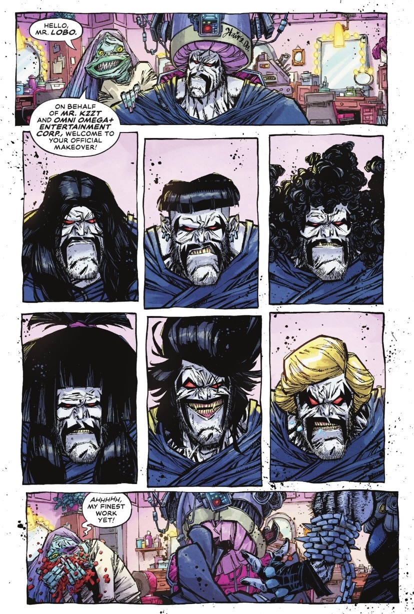
The writing in Lobo #2 leans hard into the absurdity of the “All New Lobo” reality show. Skottie Young uses the plot to mock the way corporations strip the soul out of creative properties to make them marketable. We see the intergalactic bounty hunter forced into a PG-friendly, star-patterned unitard because a monitor-headed executive named Mr. Kzzt says focus groups find leather vests a biohazard. It’s a clever way to address the real-world tension between raw creativity and corporate overreach. The script hits its stride when it forces Lobo to follow the legal requirements of his contract, like knocking on doors and reading approved statements before he can start a fight.
The real enemy here is the Omni Omega+ Entertainment Corp (O.O.E.C.) and their data-driven metrics. The humor works because it’s cynical and grounded, and watching Lobo struggle with a “kill quota” per season feels like a direct jab at how streaming services manage their content. Young captures that feeling of a veteran creator stuck in a meeting with people who have never read a comic book in their lives but have a lot of data-driven thoughts.
Neon Grit and the Art of the “Bursty” Layout
Jorge Corona’s artwork is the engine that keeps this book from feeling like a dry lecture on industry politics. His style is a frantic mix of jagged lines and neon-soaked corporate gloss. The character designs for the O.O.E.C. board members are particularly grotesque. They look like fleshy, wrinkled nightmares topped with television monitors, creating a perfect visual metaphor for the dead-eyed nature of corporate greed. Corona uses splatter effects and bursty panel layouts that make the action feel explosive even when Lobo is just standing in a boardroom.
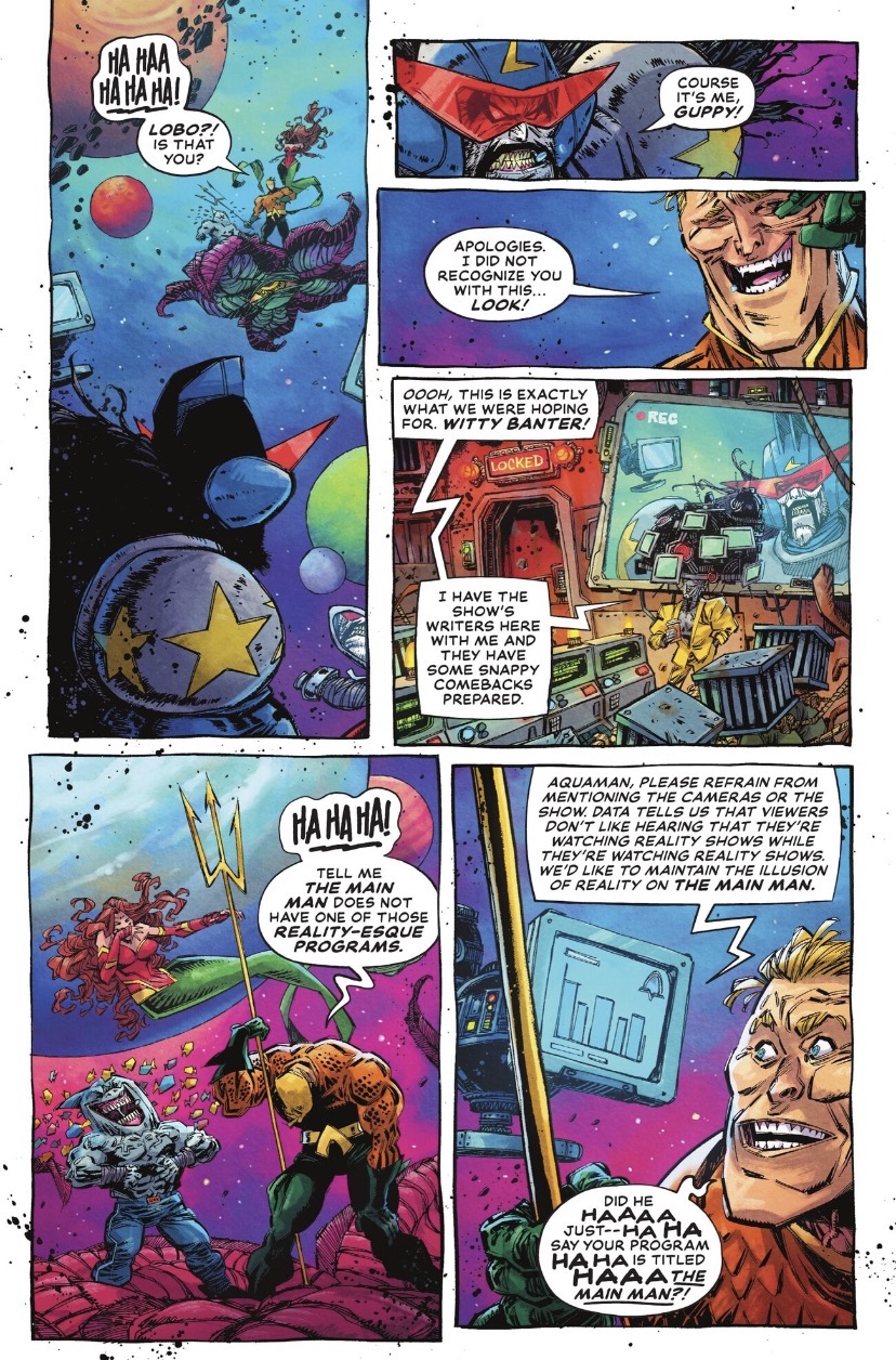
However, the color palette by Jean-Francois Beaulieu is really where this series shines. You have Lobo’s grimacing, teeth-baring expressions rendered in gritty detail, surrounded by the sterile, bright colors of the corporate world. When the action shifts to the vacuum of space for the fight with Emperor Aquaman, the art gets even more chaotic. Jorge Corona pens a sequence that feels like a fever dream of heavy inks and high-stakes production value. It all looks pretty awesome.
Why the G.R.P. Merger is the Ultimate Meta-Punchline
The final act of the issue takes the satire to an intergalactic scale with the sudden introduction of G.R.P., a thinly veiled parody of Disney. The O.O.E.C. writers decide that Lobo is already obsolete because the new corporate overlords want to pivot to a “Clown Show” backed by a character known as The Rodent. It’s a bold move that turns the comic into a manifesto against the committee mindset. Lobo’s reaction is great, especially when he finally and physically rejects the entire premise of being a “relatable” antihero.
Overall, Lobo #2 succeeds because it understands that you can’t committee a force of nature. He might have left with nothing, but he’s finally himself again, proving that while you can put the Main Man in a unitard, you can’t make him stay in it.
‘Lobo’ #2 Delivers a Sharp, Blood-Soaked Middle Finger to Corporate Branding
Lobo #2 succeeds because it understands that you can’t committee a force of nature. He might have left with nothing, but he’s finally himself again, proving that while you can put the Main Man in a unitard, you can’t make him stay in it.